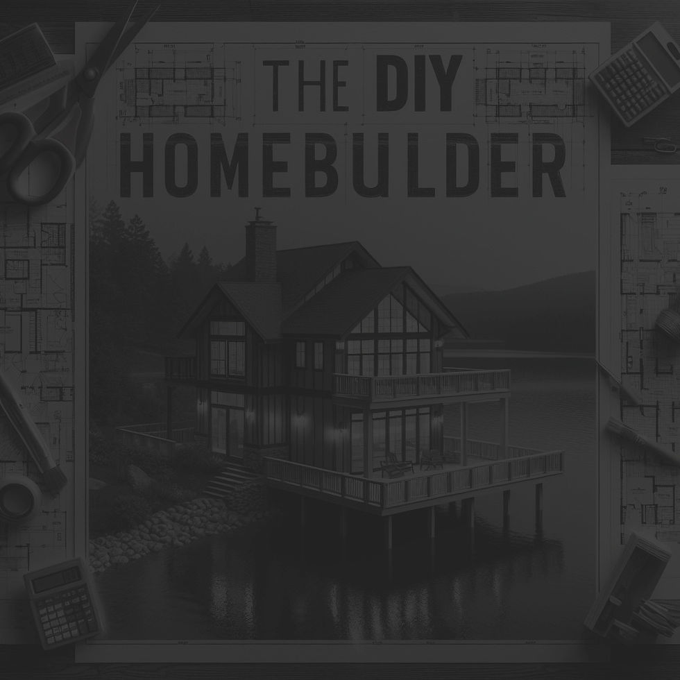
The diy homebuilder
The DIY HOMEBUILDER guides DIYers through any home construction project from their FIRST DAY DREAM about it to sipping lemonade on the front porch while admiring their FINISHED WORK.
MY RoleS
CONCEPT DEVELOPMENT PRODUCT DESIGN

GENERATIVE AI ENGINE - The core of the app that serves as an interactive construction expert during the IMAGINE - DESIGN - BUILD process.
PAID EXPERT PORTAL - The DIYer can also connect with human industry experts to assist with their project.
CORE FEATURES
What Is The AI Doing?
-
Generating concept sketches, mood boards, contracts, design docs and plans
-
Creating and managing build schedules
-
Producing how-to guides and videos
-
Creating, organizing, and tracking budgets
-
Generating materials and vendor lists
-
Storing and sorting all project documents
-
Customizable AI avatar
TOOLS
FIGMA
PHOTOSHOP
I-MOVIE
SCREEN SHOT
PREVIEW
PAGES
NUMBERS
BACKGROUND
The DIY HOMEBUILDER was born out of my experience purchasing land and building a tiny house.
I developed the app as part of a ten month Product Design boot camp through Career Foundry. During the process I worked with a tutor and mentor who are established product design professionals in the tech industry.


PROBLEM STATEMENT
Our DIY home builders need a guide to lead them through the process of building a home from beginning to end. They don’t know the right questions to ask, tools to use, or people to talk with in order to successfully walk through the complicated home building process. We will know this need exists when we see that a significant number of DIY home builders are using the app to help imagine, design, and build the home of their dreams.
SOLUTION
COMPETITIVE ANALYSIS
A thorough search was conducted to see what types of similar apps were already on the market. While there are apps that have some similar features of this app, none had a comprehensive, AI centered approach to home building for the DIY enthusiast. •PINTEREST allows people to collect images of their favorite interior and exterior home-related ideas. •SKETCH UP allows people to create home designs, but doesn't provide any guidance on how to actually build your designs. •HOUZZ can connect you with experts for questions you have, but doesn't give you a self-guided process to do your own work (among many other missing features). With this in mind, a market opening was identified as a good fit for what The DIY Homebuilder offers.
BUS. REQ. DOCS

USER PERSONAS
USER FLOWS
SITE MAP
MAX RENAULT
(hover)

SARAH JAMES
(hover)

ORIGINAL VERSION
(hover)

SARAH JAMES
(hover)

I conducted approximately half hour interviews • eight potential users • age 31 to 50 • male and female • married, married with children and single • broad range of careers and interests including retail, insurance, homemakers, realtors, and home builders. • both homeowners and renters • people interested in small DIY home projects all the way to building their own home from the ground up. Sarah and Max synthesize these user interviews and outline how the DIY Homebuilder would meet their collective needs in the DIY home building space. This should help flesh out the scope of the app and its intended audience.
MOBILE FIRST DESIGN PLAN
FEATURES LIST
(hover)

JOURNEY MAP
SARAH JAMES
(hover)


PROTOTYPE FIRST VERSION
The prototype shown below is the first iteration of the app. The Design System that follows it shows the updated version after usability testing and design feedback from colleagues was incorporated.


DESIGN SYSTEM
STYLE GUIDE


TESTING GOAL
Testing was conducted to see how intuitive the app navigation was and if there were any major roadblocks to understanding how the app is used.
TESTING PLAN
10-15 minute moderated in person / remote prototype testing with six participants was conducted.
TESTING SCRIPT
Questions in three categories related to app usage were asked:
1. Relevant background questions regarding the user’s general approach to finding information for DIY projects
2. Open-ended questions related to how they would navigate using the DIY Homebuilder app
3. Direct tasks and scenarios
There were issues with understanding the AI feature and navigating the Favorites section and a re-design was done for these elements.

ORIGINAL AI PROMPT BAR
The original prompt bar was ambiguous as to its intent, with 5 out of 6 testers seeing it as primarily a search bar. Text prompts that appeared in the center of the frame were not associated with clicking in the prompt bar to enter a prompt for the AI assistant.
UPDATED AI PROMPT BAR
The updated design eliminated other functions in the header except the secondary hamburger menu, and made the AI assistant’s face the prominent element, helping to tie it to prompt conversations.

ORIGINAL FAVES NAVIGATION
All six users were confused about or took an unintended route to get back to this main thumbnail page once they clicked on a specific choice, even though there was a back arrow.
UPDATED FAVES NAVIGATION
• each of the three main panels was displayed in the open position as a default
•tabs to the left were highlighted to show the user where they were.
•The tabs were highlighted and made clickable to be able to access all options while staying on this page.
Unmoderated preference testing was conducted online via a custom landing page on my product design portfolio website, as well as through Lyssna.com. There were ten participants total. The example below was the most important of the changes.

OPTION A
OPTION B
70% OF PARTICIPANTS SELECTED OPTION B
Accordingly the current prototype was updated to reflect this design preference.


